
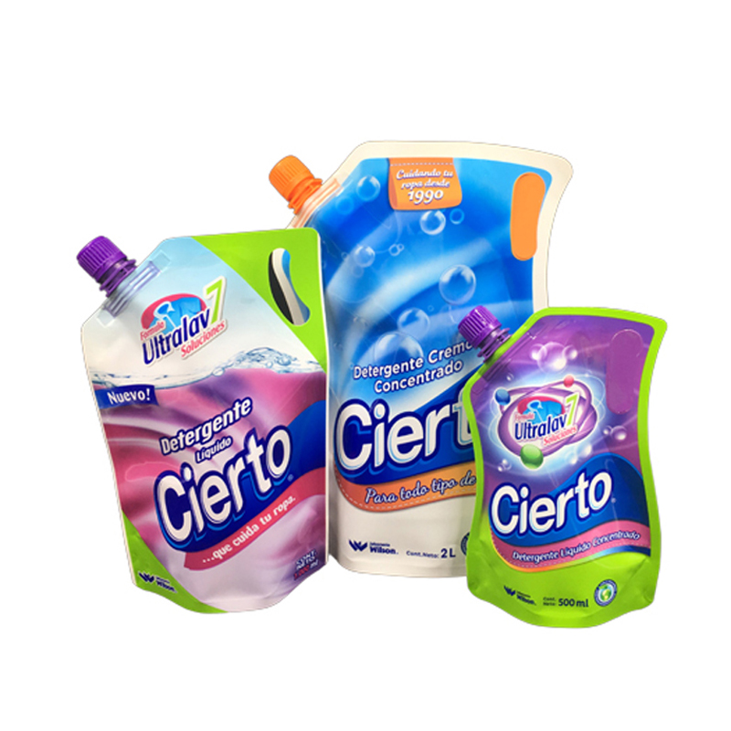
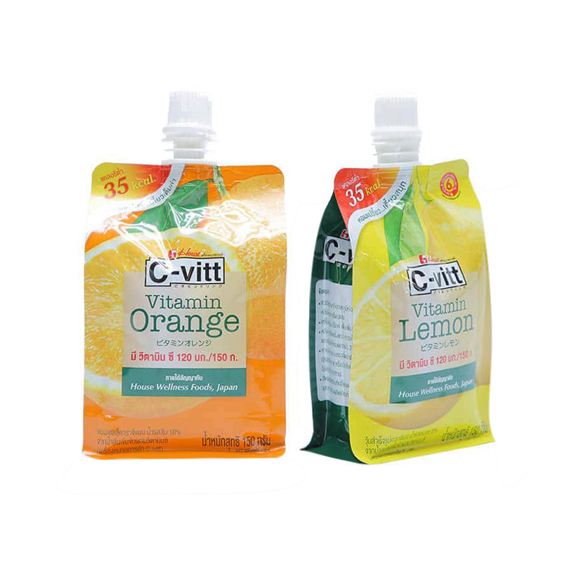
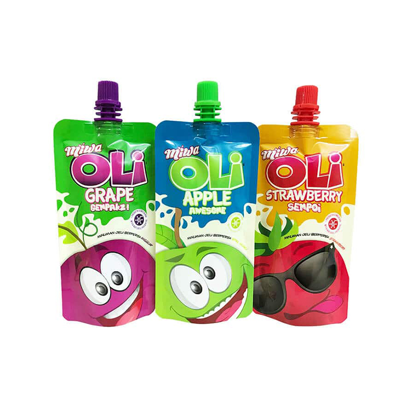
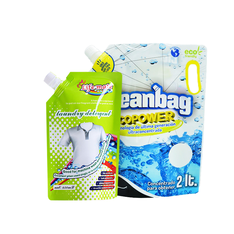
Food packaging design, first of all, brings a sense of visual and psychological taste to consumers. Its quality directly affects the sale of products. The color of many food itself is not beautiful, but it is reflected through various methods to make its shape and appearance. The colors are more perfect and richer and more attractive to customers.
①Color is the most important link in food packaging design, and it is also the fastest information that customers can receive, which can set a tone for the entire packaging. Some colors can give a good taste cues, and some colors are just the opposite. For example: gray and black make people look a little bitter; dark blue and cyan look a little salty; dark green makes people feel sour.
②Because the taste is mainly sweet, salty, sour, bitter and spicy "tongue", there are also various "tastes". In order to reflect so many taste sensations on the packaging, and to correctly convey the taste information to customers, the planner must reflect it according to the methods and laws of people's perception of color. E.g:
■The red fruit gives people a sweet taste, and the red color used in packaging is mainly to convey the sweet taste. Red also gives people a fiery and festive association. The use of red on food, tobacco and wine has a festive and fiery meaning.
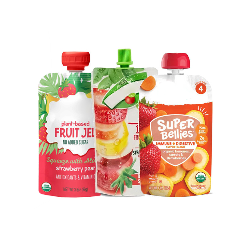
■Yellow is reminiscent of freshly baked pastries and exudes an attractive aroma. When reflecting the aroma of food, yellow is often used. Orange-yellow is between red and yellow, and it conveys a taste like orange, sweet and slightly sour.
■The fresh, tender, crisp, sour and other tastes and tastes are generally reflected in the green series of colors.
■The funny thing is that human food is rich and colorful, but blue food that can be eaten by humans is rarely seen in real life. Therefore, the primary function of blue in food packaging planning is to enhance the visual impact, making it more hygienic and elegant.
③As for the strong and weak characteristics of taste, such as soft, sticky, hard, crunchy, smooth and other tastes, designers mainly rely on the intensity and brightness of the color to reflect. For example, dark red is used to represent foods with heavy sweetness; vermilion is used to represent foods with moderate sweetness; orange red is used to represent foods with less sweetness, etc.
Post time: Aug-09-2022


