
Today, whether walking into a store, supermarket, or our homes, you can see beautifully designed, functional and convenient food packaging everywhere. With the continuous improvement of people's consumption level and scientific and technological level, the continuous development of new products, the requirements for food packaging design are also getting higher and higher. Food packaging design should not only reflect the characteristics of different foods, but also have an in-depth understanding and accurate grasp of positioning consumer groups.
Share five points of attention in food packaging design:
First, in the process of food packaging design.
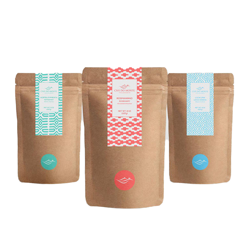
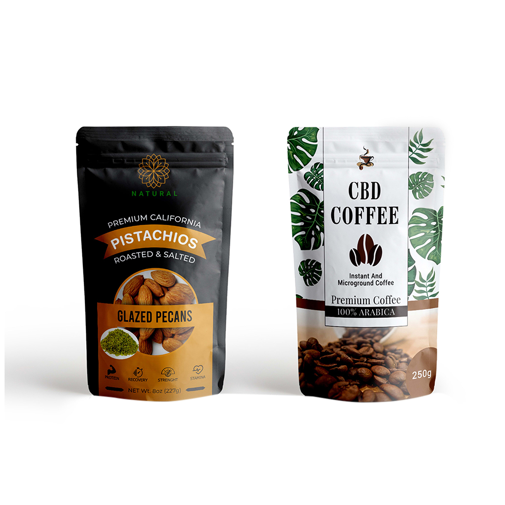
The configuration of pictures, text and background in the packaging pattern must be unified. The text in the packaging can only have one or two fonts, and the background color is white or standard full color. The packaging design pattern has a considerable effect on the customer's purchase. It is necessary to attract the attention of the buyer as much as possible and guide the user to purchase and use it as much as possible.
Second, fully display the goods.
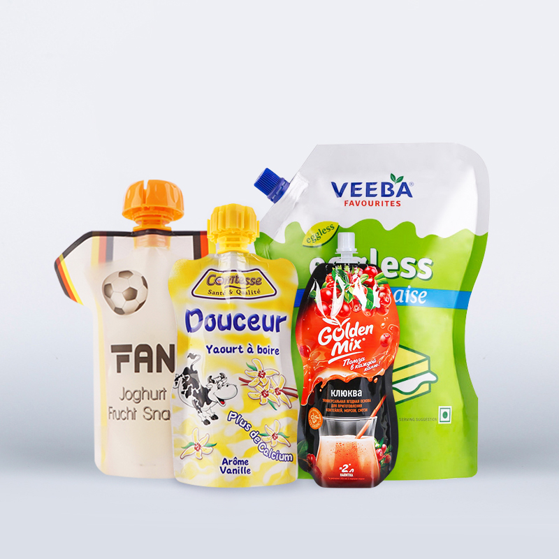
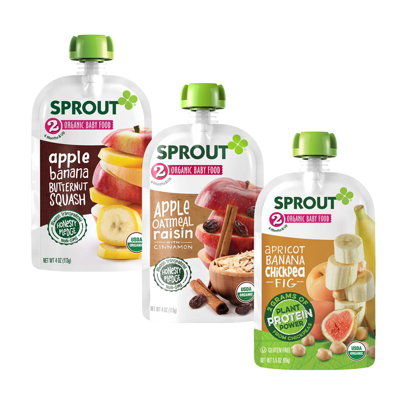
There are two main ways to do this. One is to use vivid color photos to clearly explain to the user what the food is to eat. This is the most popular in food packaging. At present, most of the food buyers in my country are children and young people. They need to be intuitive and clear about what to buy, and there are clear patterns to guide their purchases to avoid economic losses for both parties; second, Directly indicate the properties of the food, especially the packaging of novelty foods must be marked with names reflecting the essential properties of the food, and cannot be replaced by self-invented names, such as "Cracker" must be marked as "biscuits"; Layer Cake" etc. There are specific and detailed text descriptions: There should also be relevant explanatory text about the product on the packaging pattern. Now the Ministry of Health has strict requirements on the text on food packaging, and must be written in strict accordance with the regulations. The text font and color used , The size should be uniform, and the text of the same type should be placed in a fixed position so that the buyer can easily view it.
Third, emphasize the color of the image of the product.
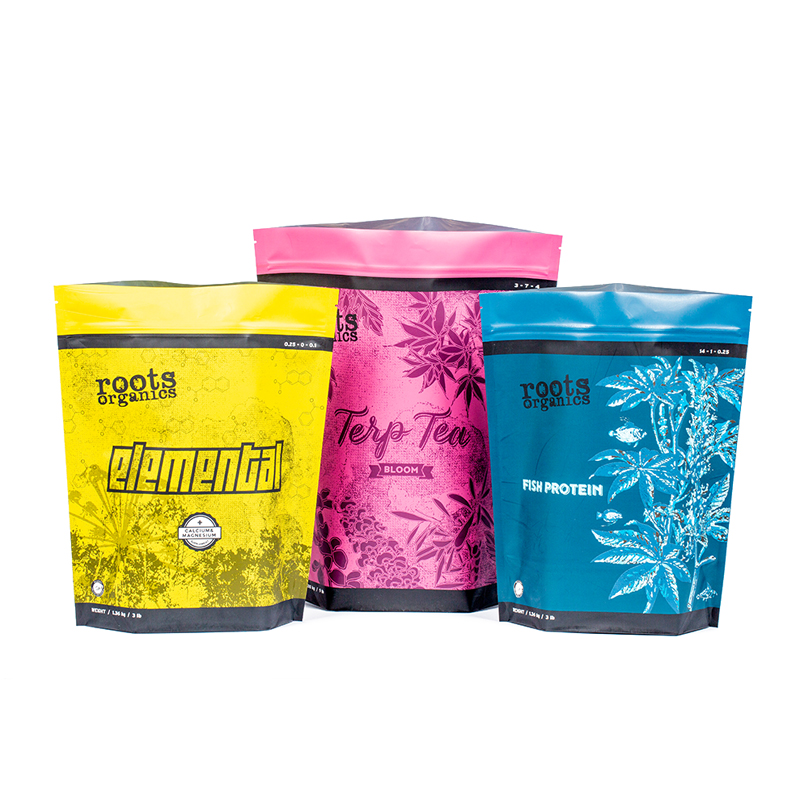
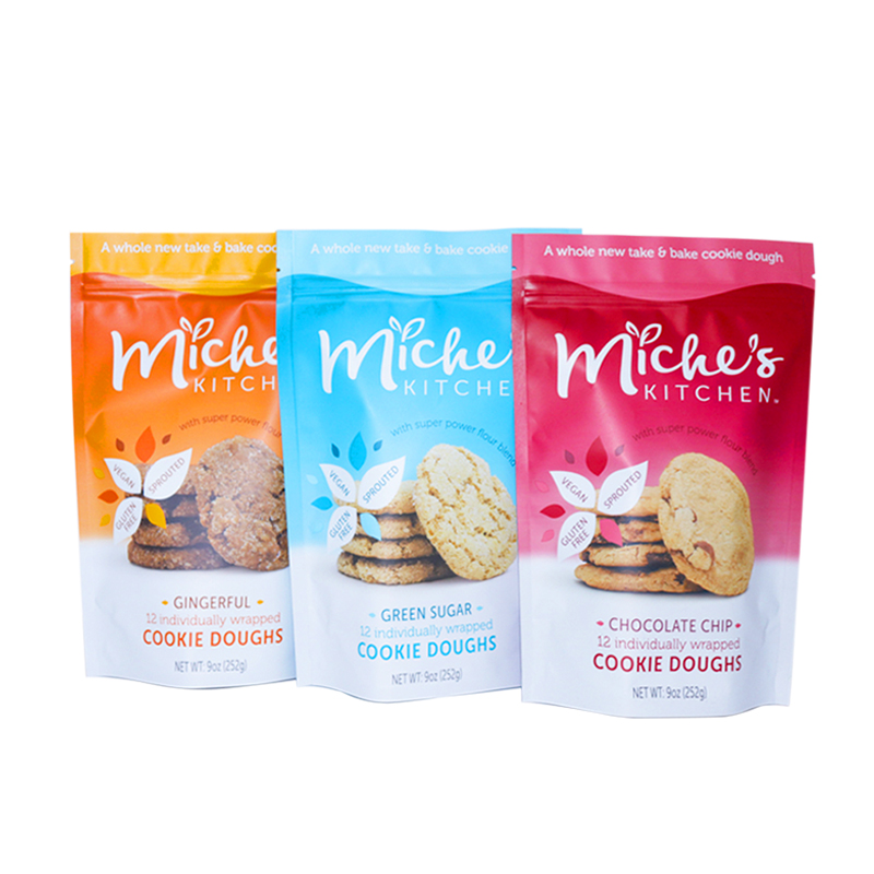
Not only the transparent packaging or color photos to fully express the inherent color of the product itself, but more to use the image tones that reflect the large categories of products, so that consumers can produce a cognitive response similar to that of a signal. , quickly determine the contents of the package by color. Now the company's VI design has its own special color. When designing the pattern, the company's trademark should try to use the standard color. Most of the colors in the food industry are red, yellow, blue, white, etc.
Fourth, unified design.
There are many varieties in the food industry. For a series of product packaging, regardless of the variety, specification, packaging size, shape, packaging shape and pattern design, the same pattern or even the same color tone is used, giving a unified impression and making customers look at it. Know whose brand the product is.
Fifth, pay attention to efficacy design.
The functional design in the packaging pattern is mainly reflected in the following aspects: protection performance design, including moisture-proof, mildew-proof, moth-proof, shock-proof, leak-proof, shatter-proof, anti-extrusion, etc.; convenience performance design, including convenience for store display and sales, It is convenient for customers to carry and use, etc.; sales performance design, that is, without the introduction or demonstration of the sales staff, the customer can understand the product only by the "self-introduction" of the picture and text on the packaging screen, and then decide to buy. The design method of the packaging pattern requires simple lines, color blocks and reasonable colors to impress consumers. Take Pepsi Cola as an example, the uniform blue tone and the appropriate red combination form its unique design style, so that the product display in any place knows that it is Pepsi Cola.
Sixth, packaging pattern taboo.
Packaging graphic design taboos are also a concern. Different countries and regions have different customs and values, so they also have their own favorite and taboo patterns. Only if the packaging of the product is adapted to these, it is possible to win the recognition of the local market. Packaging design taboos can be divided into characters, animals, plants and geometric taboos.
Post time: Aug-09-2022


